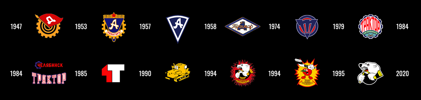
Hockey club Traktor official rebranding
BNW's brutal corporate identity for the KHL team
ART DIRECTOR AND DESIGNER. CREATOR OF CONCEPT—T-EMBLEM—MASCOT-EMBLEM*—SUBSIGNS—LETTERING—FONTS*—PATTERNS*—KITS*—BUS*—MERCH*—GUIDES*. SPORTS DESIGN STUDIO QUBERTEN, JUNE 2020
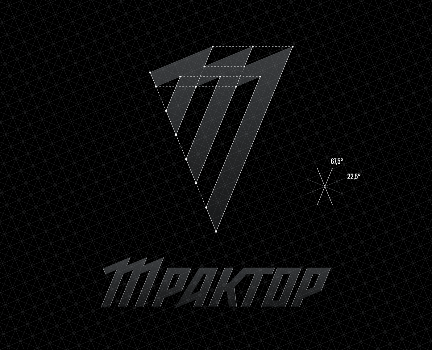
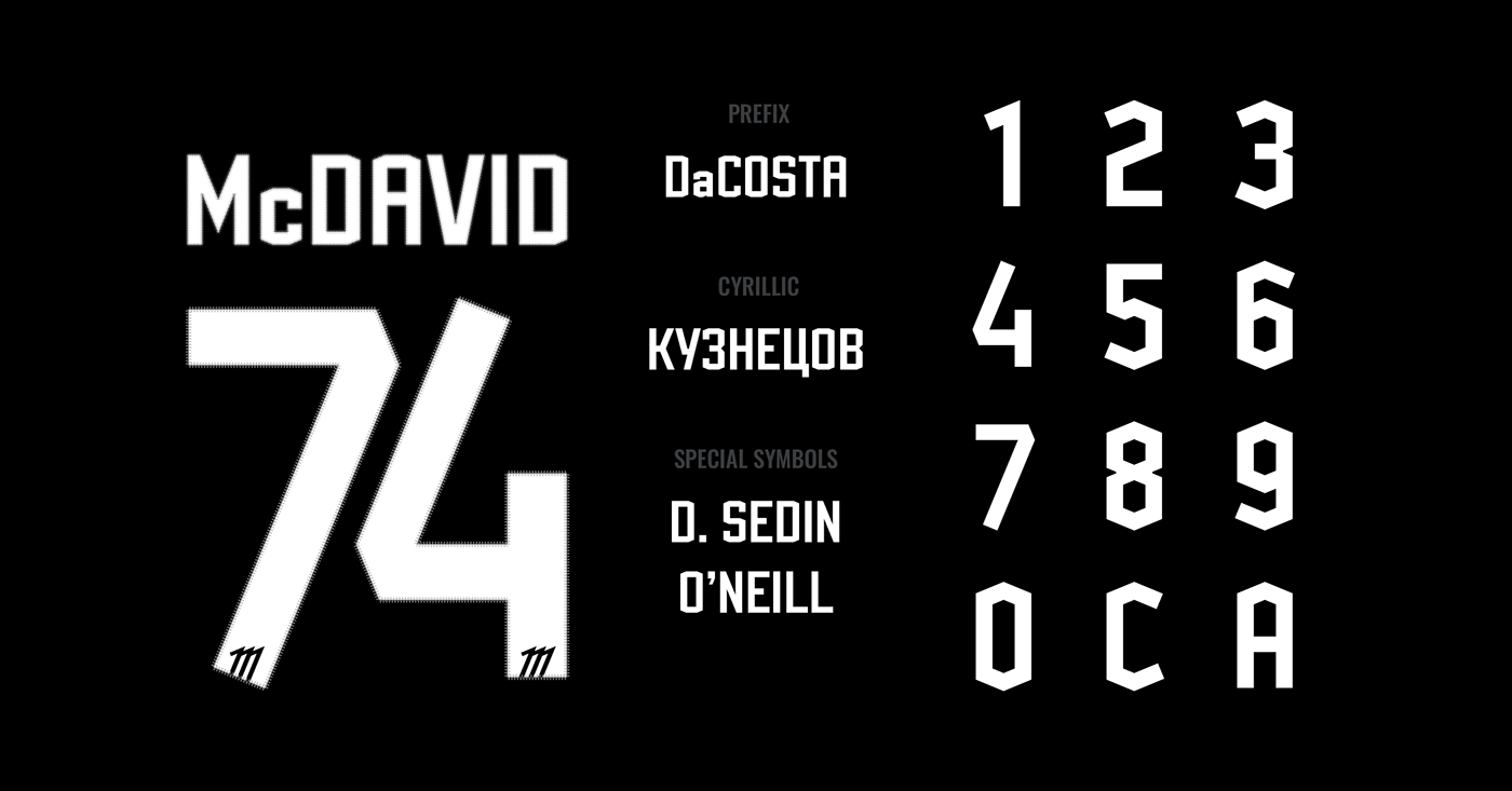
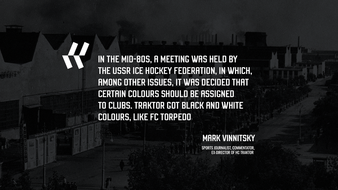
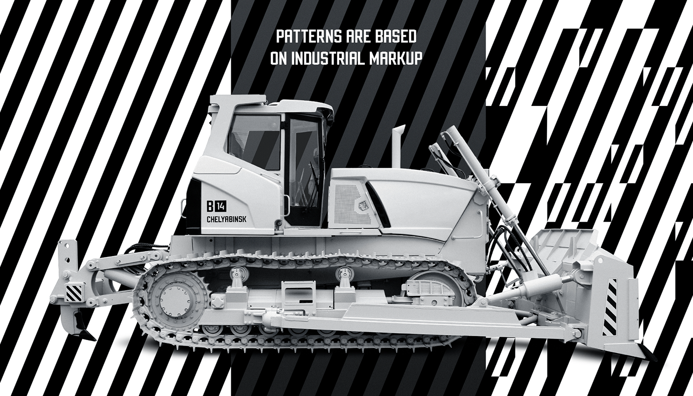
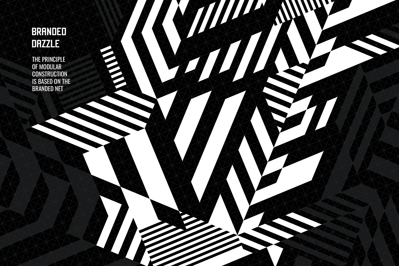
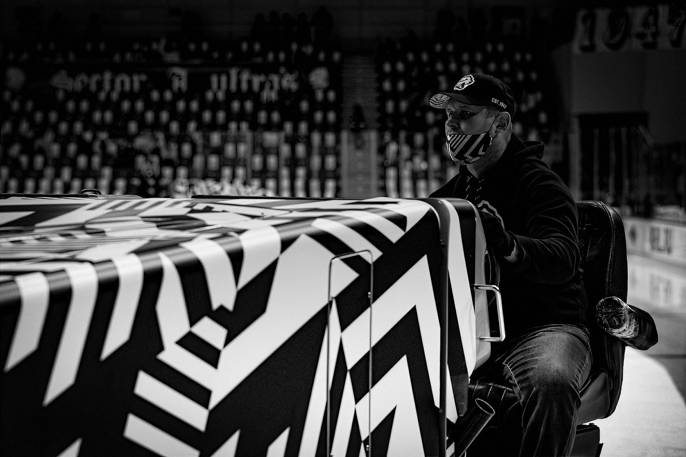
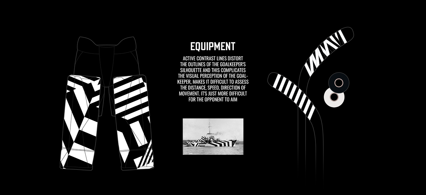
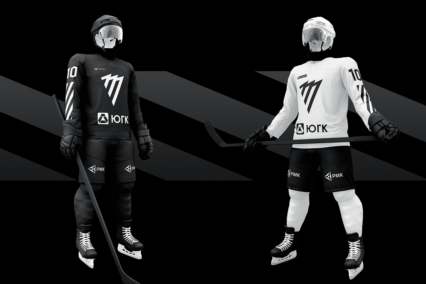
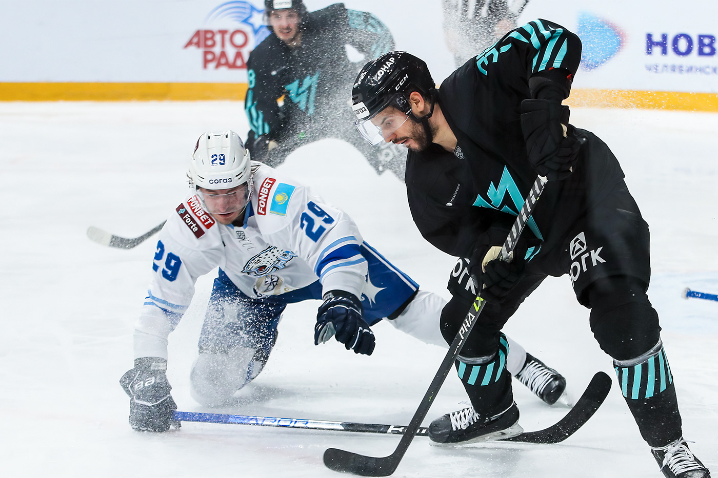
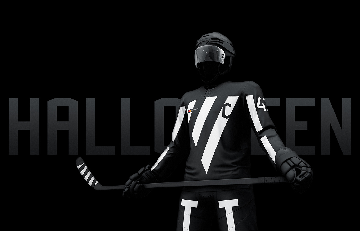
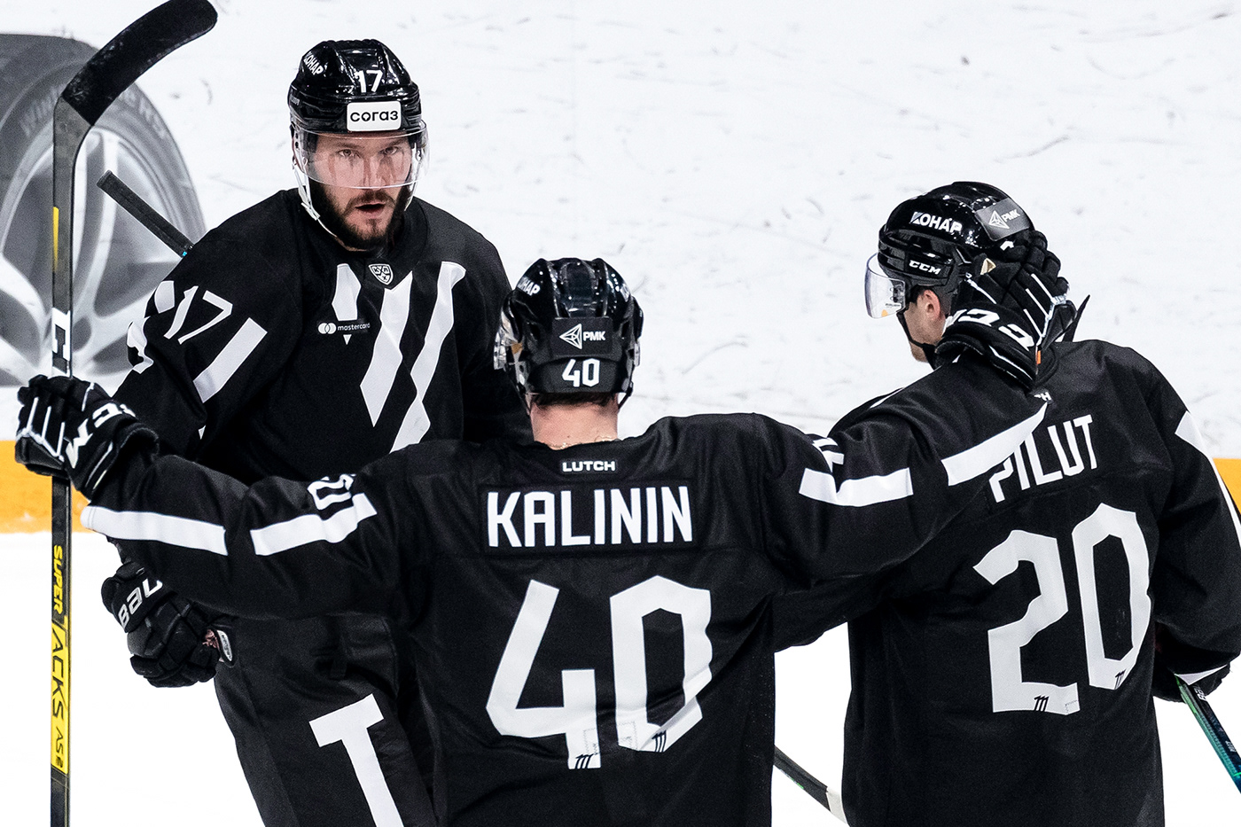
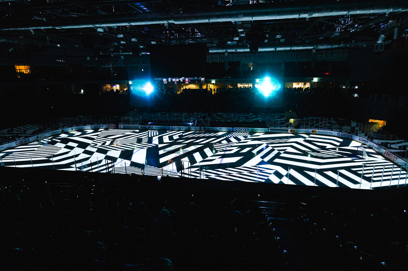
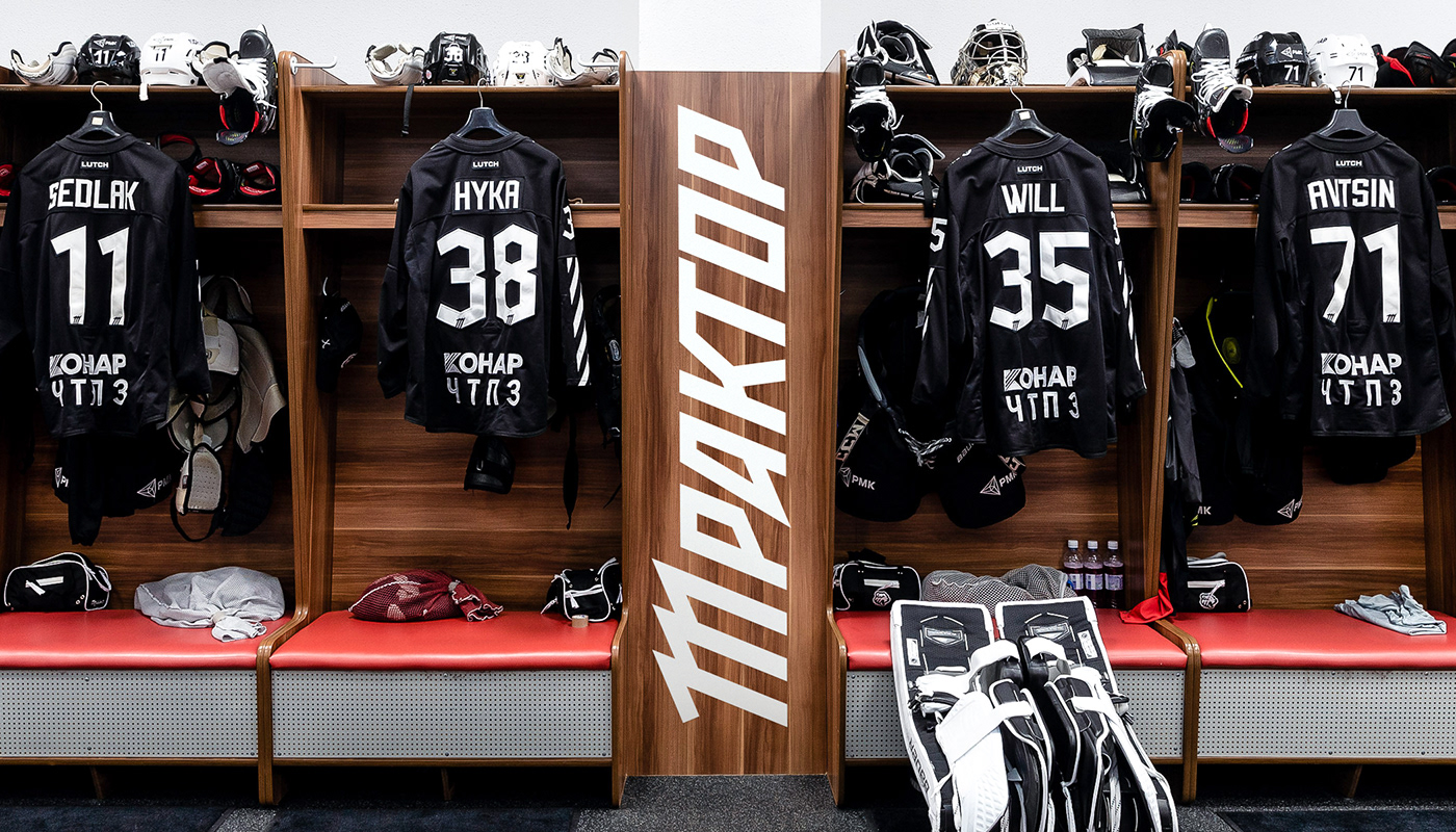
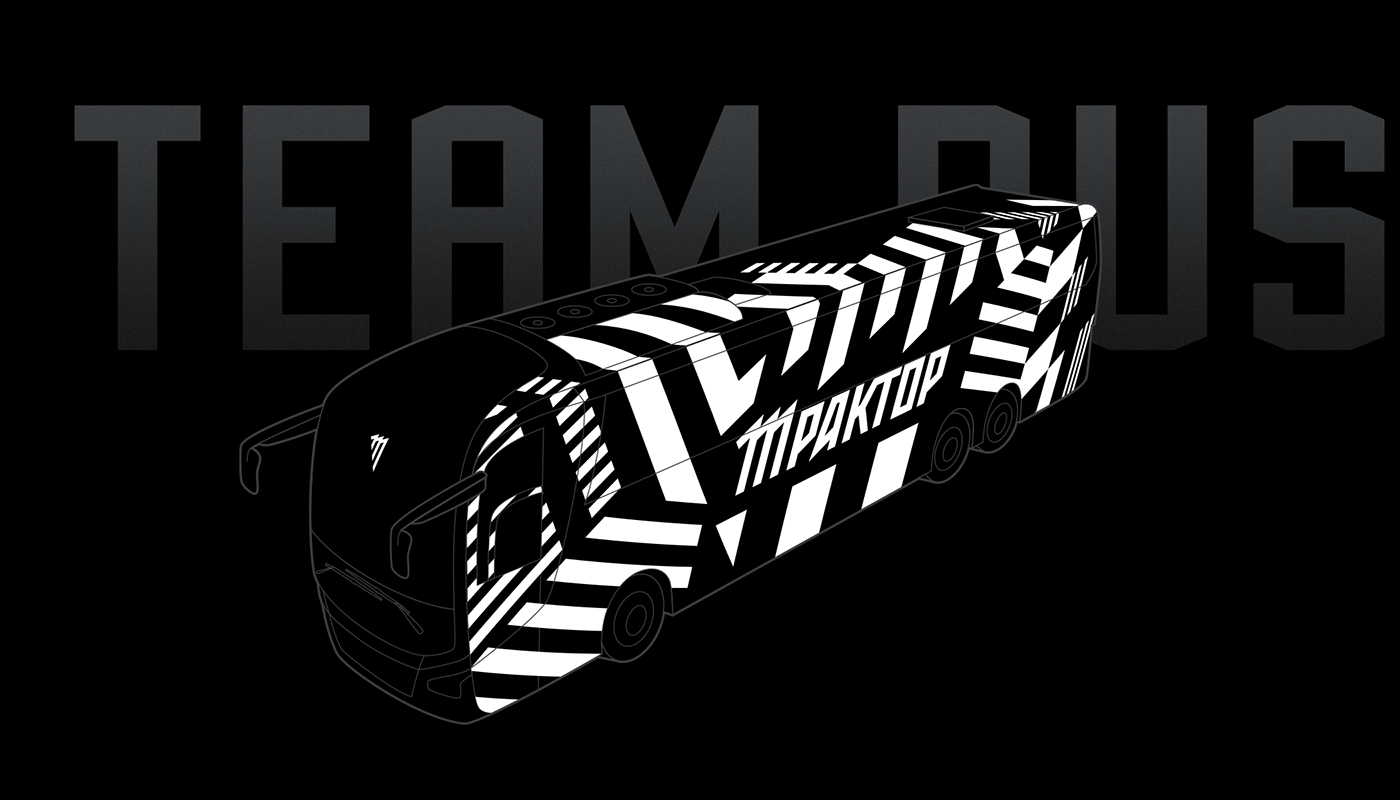
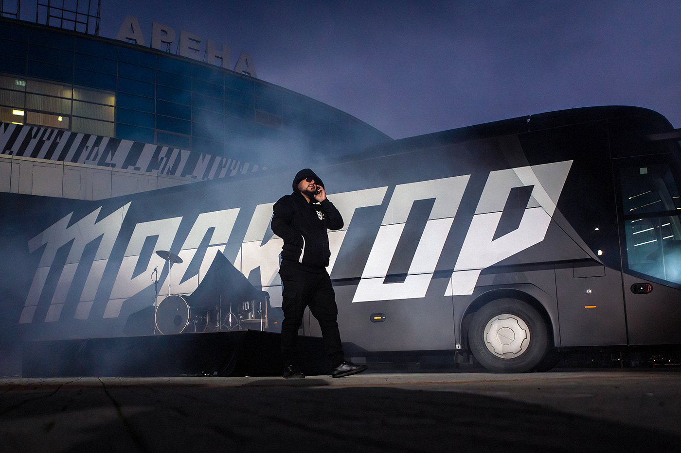
The hockey club is the oldest in the country. In addition, Chelyabinsk has a reputation as a brutal and rough city. That's why only black and white colors were chosen. This is extreme austerity. In fact the entire corporate identity is built on a single module, the angle of 22.5°. It defines emblems, fonts, and patterns. This is extreme laconicity.
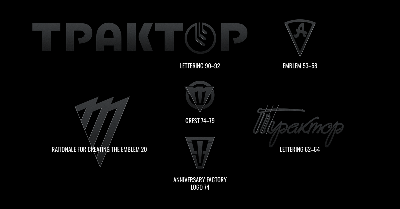
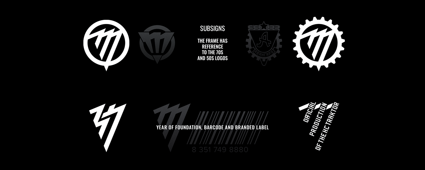
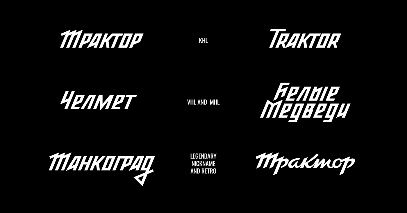
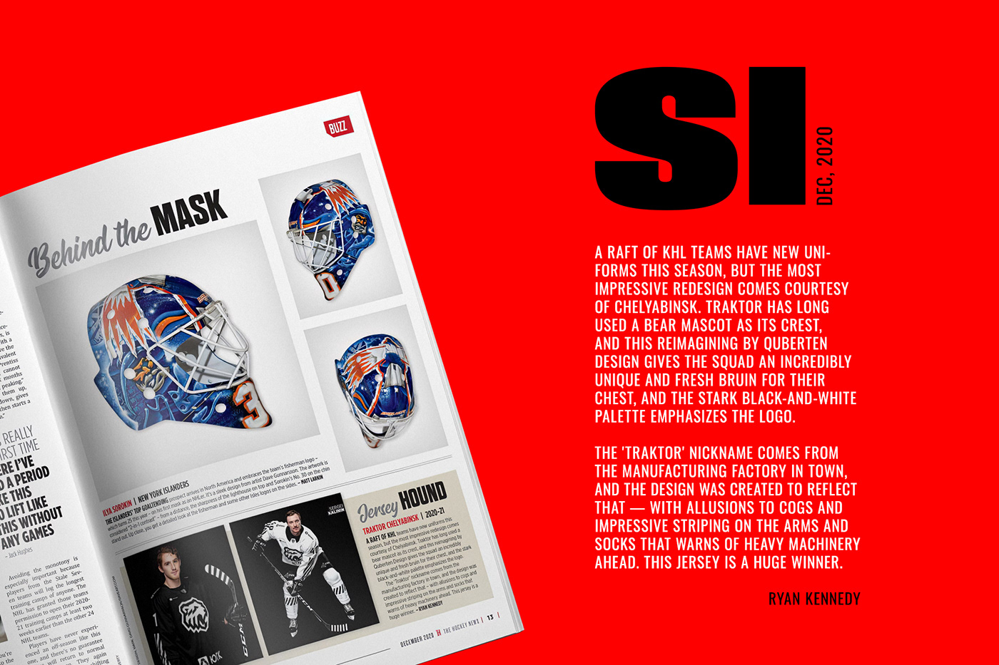
The logo combines the letter T, industrial stripes and a triangular layout, referring to the historical sub-logo of HC Traktor, the ChTZ logo to the 40th anniversary of the plant, as well as the lettering of the 90s. The logo has a derivative version in a more familiar for Traktor round frame, plus there is a version in the cog. The letter T is also supported by the main lettering, kept untouched, while the rest of the letters follow the general angle and character. The writing and logo create a tightly-knit pair which don't conflict with each other. In the centre of the idea of the Traktor style is the letter T. It is also present in the mascot version of the logo. The angles of the bear are obeyed to octagonal logic and have multiple rhymes and conjugations.
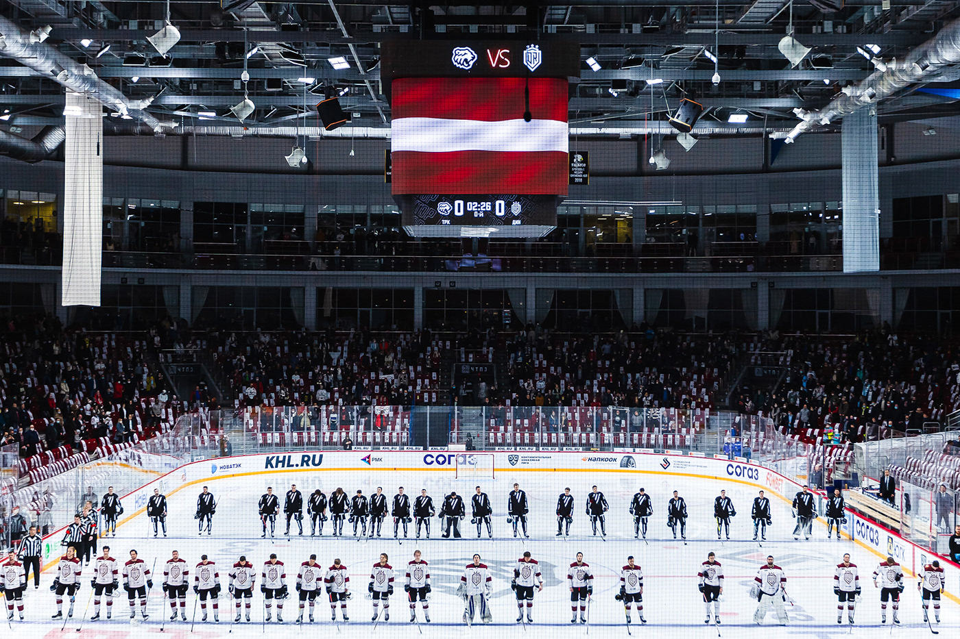
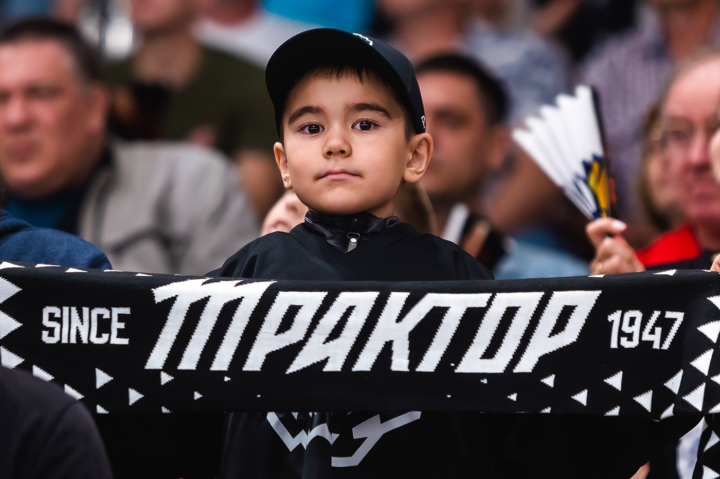
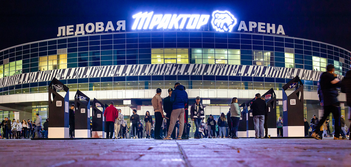
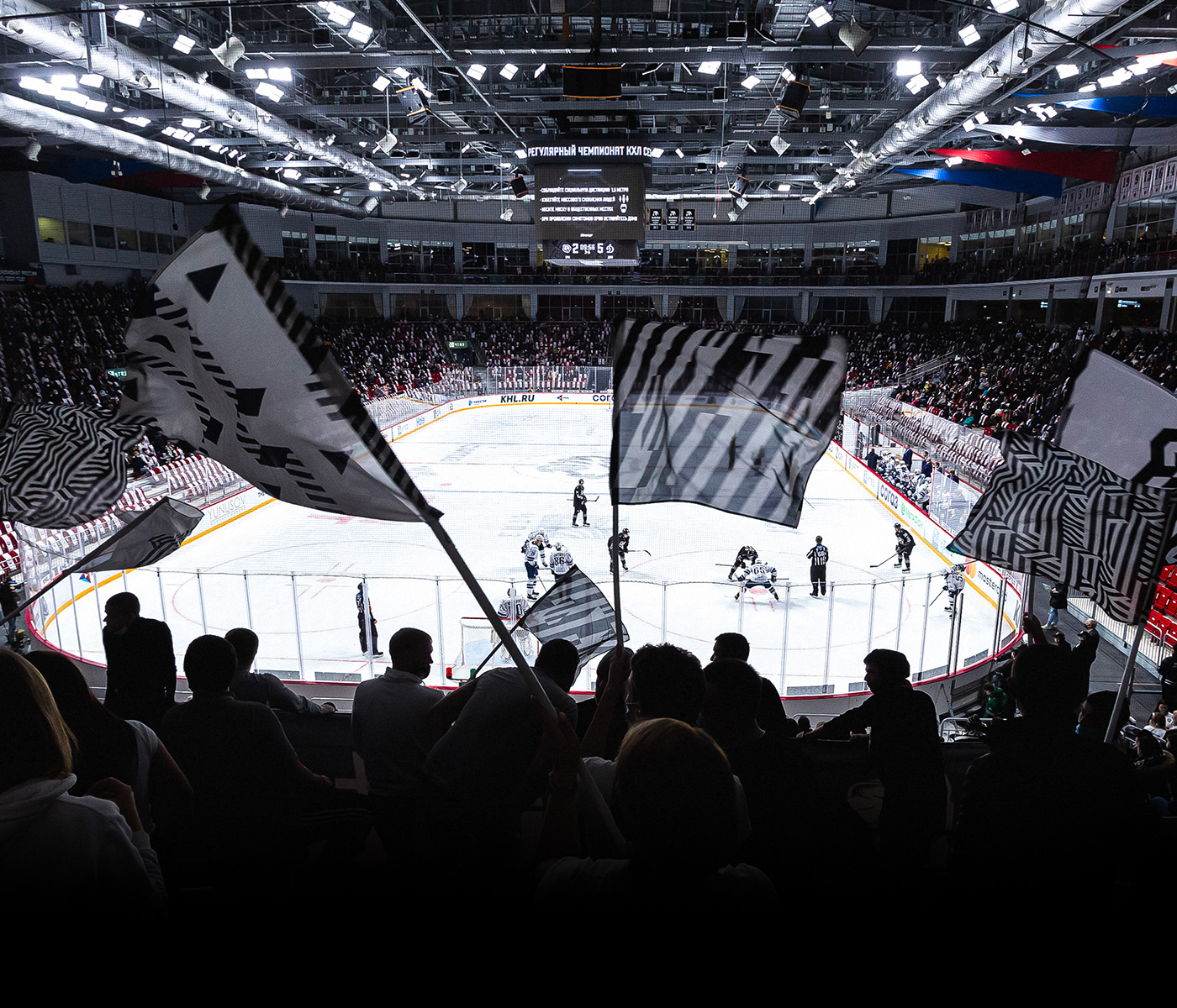
The successful work was a breakthrough in the hockey design market, and received rave reviews from fans, the near-sports communities and the design community alike. Media attention to the club has increased many times over.
Photo: HC Traktor (Pavel Tabarchuk, Evgeniy Sheryagin), Studio-VR
Video: youtube.com/@hc_traktor, @LaserSVR
Many thanks to Ivan Savin and Sergey Yakushevskiy for their help with the project
Co-authored works are marked with an asterisk